|
|
Post by visitor on Aug 15, 2012 18:59:27 GMT
|
|
|
|
Post by marchesarosa on Aug 16, 2012 11:26:40 GMT
Nothing new about Arctic sea ice or Greenland glaciers melting a bit, visitor. The interesting matter for the curious is the cause and the mechanism. Perhaps you can explain the mechanism for us, visitor? While you're at it, perhaps you could explain these to us, too? 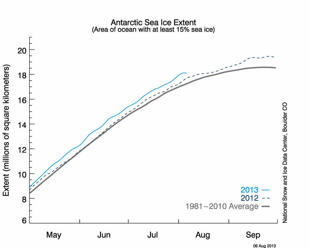  |
|
|
|
Post by marchesarosa on Aug 16, 2012 11:37:13 GMT
And what about this Central England temperature record of which the Met Office is the guardian, which is the longest in the world and is accepted to be a good indicator of the whole Northern Hemisphere temperature trend? It has been described as demonstrating "the long, slow, thaw" out of the Little Ice Age (Thames Frost Fairs and all that). The rate of temperature rise in the 1730s was pretty much the same as as the last quarter of the 20th century. The only material difference between then and now is that the Urban Heat Island Effect was probably not much in evidence then. Nor was the level of CO2 a cause of of concern (to some) back then.  People who are interested in extending their understanding of historical temperature variation could learn something useful from this thoughtful article by Tony Brown on Judith Curry's blog, Climate Etc, last year. judithcurry.com/2011/12/01/the-long-slow-thaw/ |
|
|
|
Post by marchesarosa on Aug 16, 2012 12:02:49 GMT
Do you ever pay attention to the weather forecasts on tv, visitor?
Are you ever curious as to why London is often one, two or three degreesC warmer than the surrounding region? Do you ever wonder why the weather presenter in winter often informs you that rural areas will be cooler and perhaps liable to frost?
It's all because of The Urban heat Island Effect, dear.
Car thermometers, despite your derision, can very well illustrate the change in temperature from rural to suburban, city centre, suburban and out to the countryside again as a transect journey is made of a city.
Or are we supposed NOT to believe our lying eyes, visitor? Are we supposed to ignore the fact that thermometers in pristine rural sites register a much lower temperature trend than ones in urban areas or even in slightly developed rural areas? Does this never make you ponder the accuracy of the "global mean" temperature record on which climate alarmism is based?
|
|
|
|
Post by visitor on Aug 16, 2012 12:49:05 GMT
Marchesarosa - you have your very own blog where you get to choose who posts and your very own room on this blog where ONLY you can create threads yet you have this knee jerk reaction to post irrelevant piffle whenever somebody else posts scientific evidence.
|
|
|
|
Post by marchesarosa on Aug 16, 2012 13:02:10 GMT
I am a founder member of this board, visitor. I am entitled to respond to your posts or anyone else's. That is what message boards are about. You have the whole internet to express your opinions on if you don't like this board.
Toodle-oo.
|
|
aubrey
WH Member
 Seeker for Truth and Penitence
Posts: 665
|
Post by aubrey on Aug 27, 2012 6:44:39 GMT
You've made this thread very hard to read, Marchesa. Would it be possible to reduce the size of the image you've posted?
And why is your last post an exact copy of one that you did earlier?
Not at all patronising.
Allowing for urban heat is not the same as not believing the MET office, who will usually say that the temp will be warmer in cities anyway.
Bitter, because they haven't printed any of your "Intelligent Lay Person's Comments," Marchesa? I mean, you're not a well known or any kind of climatologist are you? Yet you still think you're entitled to publish your opinion.
And when a real climatologist publishes anything that you don't like, you feel free to slag him off, say he's corrupt, in the pay of Govts, etc. But when that well-known Climatologist Nigel Lawson says something that you agree with you're all over the bastard.
|
|
|
|
Post by marchesarosa on Aug 27, 2012 11:12:10 GMT
Yes, certainly, everyone with half a brain cell knows about the urban heat island effect, aubrey. Unfortunately it is not adequately adjusted for in global average temperature estimates. In fact global average temperature adjustments are always upwards, whereas the UHIE requires a downward adjustment since the majority of the surface stations currently in use are in urban areas or at airports and even most of those in supposedly rural areas are affected by encroachments of the built environments, roads, pavements etc to some extent. NOAA instituted a new set of surface stations a few years ago called the USCRN (United States Climatic Reference Network) however they choose not to publicise it and prefer to keep promoting the travesties of the older stations (USHCN (United States Historical Climatology Network) most of which are extremely badly sited sensors because, OF COURSE, these "findings" stoke the fires of alarmism over rising temperatures. The recent hot July in the States was claimed to be a "record" based upon the “gold standard” USHCN station network. But this was about 2 deg. F warmer than a straight average of the 114 core US Climate Reference Network (USCRN) stations. Read these articles if you want to learn something from people intimately involved in climatology/meteorology. An ‘inconvenient result’ – July 2012 not a record breaker according to data from the new NOAA/NCDC U.S. Climate Reference Networkwattsupwiththat.com/2012/08/08/an-incovenient-result-july-2012-not-a-record-breaker-according-to-the-new-noaancdc-national-climate-reference-network/Spurious Warmth in NOAA’s USHCN from Comparison to USCRNwww.drroyspencer.com/2012/08/spurious-warmth-in-noaas-ushcn-from-comparison-to-uscrn/ |
|
|
|
Post by marchesarosa on Aug 27, 2012 11:26:42 GMT
By the way, which looks scarier, Aubrey? This 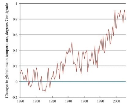 or this? 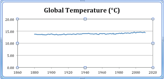 The former shows the purported deviation or "anomalies" from a long term global average mean temperature while the latter shows the purported absolute global mean temperature. If the latter graph had been plotted in degrees Kelvin it would have appeared even less scary. In fact, it would have hardly differed from a level straight line! A temperature rise from 287K to 287.8K is not very scary at all. |
|
aubrey
WH Member
Seeker for Truth and Penitence
Posts: 665
|
Post by aubrey on Aug 27, 2012 13:05:45 GMT
Changing the resolution always has an effect like that. Which one would you use?
People on Mercury will be saying that we don't know we're born.
|
|
|
|
Post by marchesarosa on Aug 29, 2012 8:47:12 GMT
Of course! It's an easy sell that works on simpletons, Aubrey. But why should supposed climate "scientists" be using the tricks of snake oil salesmen? Jarvis Cocker claims the Arctic Sea ice has declined 75% since 1979 when the actual situation is as illustrated below.  Why is The Guardian publicising a trick which only the gullible or uninformed could fall for? |
|
aubrey
WH Member
Seeker for Truth and Penitence
Posts: 665
|
Post by aubrey on Aug 29, 2012 15:10:09 GMT
Why should sceptics be doing the same?
If one method is cheating, so is the other. And if you're showing a small but significant change, you have got to have a high enough resolution that it can be seen.
|
|
|
|
Post by visitor on Sept 7, 2012 18:22:20 GMT
|
|
|
|
Post by marchesarosa on Sept 8, 2012 1:25:09 GMT
The fact that there is still a remnant of ice at the poles and on mountain tops is the demonstration that this planet is still in a millions of years long "ice age". Every hundred thousand years to so the temperature rises just enough to give us a brief interglacial period (like now) when mankind and all other life forms have flourished as it gets WARMER. After that the planet goes back into the freezer for another hundred thousand years or so. Worry about the current brief interglacial coming to an end, if worry turns you on, not the nugatory effect of the addition of a small amount of a trace gas that greens the planet by making the plants thrive. The Arctic comprises only 6% of the globe's surface, Try turning your attention to this below, instead, eh, if you want to know why weather and temperature varies from year to year and decade to decade?  It is called the Pacific Ocean and it is bigger in area than all the world's land masses together. What's more, it straddles the Equator for half the globe's circumference and, at three miles deep, it absorbs far more of the sun's energy, day in and day out, than anywhere else on Earth. When it releases that heat, as it does by the mechanism of El Ninos and La Ninas, the whole world's weather and the global mean temperature is affected. When you've exhausted the Pacific as a subject of study, Aubrey, have a look at Antartica, down there at the bottom and all white, because it is not just a diversion to stop the worried well of the West from wetting themselves over Arctic sea-ice melt, it is an important part of the planet's eco-system - ultimately FAR more important that the puddle at the North Pole that grows and shrinks with the seasons and in response to variations in ocean currents, air pressure and, yes, wind (which blows sea ice about and into the North Atlantic where it most certainly MELTS because, for the present, we are STILL at the tail end of one of the blessed interglacial intervals that briefly punctuate a very long ice age). |
|
|
|
Post by marchesarosa on Sept 8, 2012 3:34:05 GMT
Just discovered this, and it is relevant to visitor's posturing that consideration of Antarctica is some sort of a sceptic ruse. If she knew as much about climate as she does about psychologising over the behaviour of sceptics she might make some progress. "Compared to seasonal norms, the “coldest” spot on the globe in August was near the South Pole, with average temperatures as much as 3.38 C (6.08 F) colder than normal for the month." more here pielkeclimatesci.wordpress.com/2012/09/05/global-temperature-report-august-2012-from-the-university-of-alabama-at-huntsville/Perhaps visitor can also explain to us why the South Pole has been cooling for the last half century, since she apparently thinks she knows why summer Arctic sea ice is melting a bit? |
|