|
|
Post by visitor on Dec 22, 2011 18:56:32 GMT
Global Warming Continues And yes, the warming is continuing. The 2000s were hotter than the 1990s, which were hotter than the 1980s, which were hotter than the 1970s. 2010 tied for the hottest year on record. The 12-month running average global temperature broke the record three times in 2010, according to NASA Goddard Institute for Space Studies (GISS) data. Sea levels are still rising, ice is still receding, spring is still coming earlier, there's still a planetary energy imbalance, etc. etc. Contrary to what some would like us to believe, the planet has not magically stopped warming. Those who argue otherwise are confusing short-term noise with long-term global warming  www.skepticalscience.com/updating-the-big-picture.html www.skepticalscience.com/updating-the-big-picture.html |
|
|
|
Post by marchesarosa on Dec 22, 2011 19:54:07 GMT
Why didn't you show the trend in temperature like this, visitor? You could also have extended the graph a little further back in time as below. You could have included ocean temperatures (71% of the planet's surface area and 97 percent of the planet's water) in your nice picture, instead of just the land temperature that John Cook at SkS used. 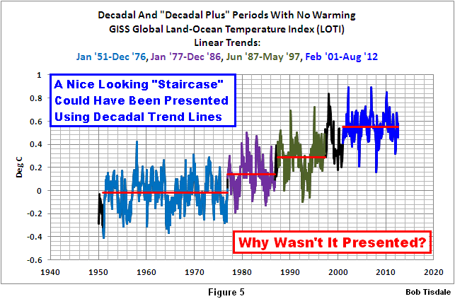 Here, you see a nice staircase and the steps are divided by the naturally occurring El Nino phenomenon starting with what is called the Great Pacific Climate Shift in 1976 which shifted the surface temperature of the entire Eastern Pacific Ocean (about 33% of the surface area of the global oceans) up about 0.17 deg C.
There are two more break points. They occurred at 1987 and 1997, both of which correspond to the monstrous, but naturally occurring, El Niño events of 1986/87/88 and 1997/98.
El Niño and La Niña events are the largest naturally occurring weather phenomenon Mother Nature has devised. Sea levels in parts of the eastern tropical Pacific temporarily rose approximately 33 cm (about 1 foot) and warmed in places almost 5 Deg C (9 Deg F) during the El Niño of 1997/98—all the result of a huge volume of warm water that was created naturally during the 1995/96 La Niña and then shifted east almost halfway around the globe by that El Nino. All of that warm water, much of it now on the surface, released a tremendous amount of moisture through evaporation into the atmosphere. Weather patterns changed for years after that El Niño. When the planet is on a stepwise warming trend driven by natural Oceanic variation the sequence of warmer decades is unexceptional, visitor. No-one denies the planet has warmed since the Little Ice Age ended in the mid-19th century. The point, however, Visitor, is why? Bob Tisdale has provided an answer to the question of "Why" above. Can you? |
|
|
|
Post by visitor on Dec 22, 2011 19:58:55 GMT
You clearly did not click on the link or you would have seen exactly how man's fingerprint is all over this climate change - try educating yourself, read a little wider than your usual denier blogs. www.skepticalscience.com/its-not-us-advanced.htm- Shrinking upper atmosphere - Less heat escaping to space - Cooling upper atmosphere - Rising tropopause - Winter warming faster than summer - Nights warming faster than days - More fossil fuel carbon in trees - More fossil fuel carbon in corals - More fossile fuel carbon in the air - More fossil fuel carbon in the air - More heat returning to earth - Pattern of ocean warming - More fossil fuel carbon in the ocean Each of these statements has come about by independant scientific investigation (not conspiracy and opinion by a bunch of think tanks) Follow the link to learn the truth - why wallow in ignorance when the facts are there for all to read? |
|
|
|
Post by marchesarosa on Dec 22, 2011 20:00:39 GMT
You have started your graph, visitrix, at the beginning of the late 20th century warming trend. Why did you not show the decline in global temperatures from 1945 to 1975? You can prove anything you wish with the right selection of start and end points. And that is not even taking into account the "adjustments". See how James Hansen has reduced past temperatures and increased recent ones in order to make the "trend" look more alarming.   |
|
|
|
Post by visitor on Dec 22, 2011 20:07:22 GMT
Why did you not show the decline in global temperatures from 1945 to 1975? Because that is called cherry picking - just like the graph I linked to. Deniers love to pick small sections of the temperature record and claim that shows the trend overall. Why are your graphs of USA only - cherries anyone? |
|
|
|
Post by admin on Dec 22, 2011 23:50:10 GMT
Let's keep it polite like the last one. |
|
|
|
Post by marchesarosa on Dec 23, 2011 9:13:34 GMT
You could just as well say that alarmists "love to pick small sections of the temperature record and claim that shows the trend overall."
Do you seriously believe, visitrix, that in the whole scheme of things the highly dubious "record" since 1973 is good enough to extrapolate from to make a century long term prediction about the impact of a little extra CO2?
I suppose you think there is such a thing as a free lunch, too.
|
|
|
|
Post by marchesarosa on Dec 24, 2011 8:48:24 GMT
Here's a pretty picture of the longest instrumental temperature record in the world. (The CO2 record has to be taken with a pinch of salt, however.) The evidence of "this long slow thaw is clearly at odds with the current view of climate history" states Tonyb.  |
|
|
|
Post by marchesarosa on Dec 24, 2011 9:08:13 GMT
Here are some more lengthy temperature records. Since the measuring stations are all now located in urban areas they demonstrate the urban heat island effect which now contaminates nearly ALL the surface stations included in the three global temperature databases.   Not terribly alarming, are they, these long slow temperature rises from the Little Ice Age? |
|
|
|
Post by marchesarosa on Feb 4, 2012 9:54:46 GMT
|
|
pippop
pc  I love everyone here.
Posts: 1,110
|
Post by pippop on Feb 4, 2012 18:23:14 GMT
|
|
|
|
Post by marchesarosa on Feb 5, 2012 13:36:12 GMT
|
|
|
|
Post by marchesarosa on Mar 10, 2012 13:13:39 GMT
Here's another "Big Picture"!  It is a plot of the changing 30 year trends of the Global Mean Temperature. It covers the period 1880 to date. Each dot represents the average of the change over the previous 30 years' data. You can see that there appears to be an oscillation around a slight upward overall trend. Of course if you only pick a small part of this 130 year period as "representative" you could easily mislead yourself and others about the "Bigger Picture". Of course, even this, the longest "global" instrumental record available, might not be representative of the "Even Bigger PIcture". Lesson. It's wise to be conservative in one's claims - especially when projecting apparent "trends" into the future. |
|
|
|
Post by marchesarosa on Mar 19, 2012 11:39:05 GMT
The picture we usually see for the trend of the last few decades is all downhill but if you add in the pre-satellite era data that was illustrated in the earlier IPCC reports it changes the picture somewhat. Looks a tad more "cyclical" than linearly downhill, don't you think?  wattsupwiththat.com/2012/03/18/sea-ice-news-volume-3-2/ wattsupwiththat.com/2012/03/18/sea-ice-news-volume-3-2/ |
|
|
|
Post by marchesarosa on Mar 26, 2012 18:24:37 GMT
David Appell sees the light! "Are we really going to rebuild all of civilization to avoid the occasional heat wave and rising seas and some slightly stronger hurricanes? I was thinking about this last night, and the answer is clearly no.
Yes, these aren’t the only impacts of climate change, by any means, but we get a lot of value from burning fossil fuels. A lot. There is as yet no viable substitute for them.
I was thinking about my personal list of concerns, the big ones, and the honest answer is climate change is pretty far down the list, after health care, income (and so, the economy), clean local air and water, crime, and then things like war and terrorism and then hungry and poor people across the globe and animal suffering and probably a few things that aren’t occurring to me now, and then climate change.
Sorry, but that’s the truth."more here wattsupwiththat.com/2012/03/26/quote-of-the-week-warmer-turns-cooler/#more-60175Anthony praises David .... he’s been steadily publishing articles that are starting to make sense to those of us that don’t fret fearfully about AGW, climate change, and weather is not climate unless we say it is. And, he’s even calling out people like Bill McKibben and Peter Gleick for their selective over the top rhetoric and dishonesty. The light bulb seems to have gone on for Appell, and it isn’t a twisty bulb. |
|