|
|
Post by marchesarosa on Nov 11, 2011 21:46:08 GMT
You forgot the "going down the up escalator", analogy, visitor.
Seriously, though, when you can find evidence that CO2 is causing runaway climate catastrophes
people may pay a bit more attention again to the fading warmist message.
All you have is a brief correlation from 1975 to 1998 of growth in man made CO2 emissions alongside
a rather brief period of "global" (who he?) temperature increase that even the blessed Phil Jones agrees
was no different from the rate or duration of the "global" temperature increase from 1910-1940.
Since the peak El Nino year of 1998 temperatures have levelled off while the anthropogenic CO2
has continued to rise inexorably thanks to India, China and Brazil.
Telling us that colder winters are caused by global warming will not wash, m'dear.
Telling us that sea levels are rising when they too have levelled off will not wash.
Telling us that "missing heat" predicted can be found in the ocean abysses will not wash.
Telling us that Greenland and Antarctica will melt will not wash.
Nothing is happening today that has not happened before during this interglacial.
That is why alarmism is on a hiding to nothing.
Sceptics do not deny the temperature has increased a bit.
What you have yet to demonstrate is that humans have caused even a part of it or that it is more harmful
than the natural variation we have experienced so far.
So back to the drawing board with you and good luck with the "wave" analogy. Did you get it from SkS?
|
|
|
|
Post by visitor on Nov 12, 2011 10:28:24 GMT
|
|
|
|
Post by marchesarosa on Nov 12, 2011 10:51:04 GMT
Well that is hardly surprising at the culmination of a period of warming, is it?
The matter of interest remains the CAUSE of the measured warming.
I'm really surprised to see that David's "ten year moving average" manages to get as far as 2011.
Please explain how this trick is achieved, visitor.
Would not a ten year moving average for 2011 require data from c 2006 to c 2016?
|
|
|
|
Post by visitor on Nov 12, 2011 11:03:14 GMT
Would not a ten year moving average for 2011 require data from c 2006 to c 2016? No - the ten year moving average is the data from 2000 to 2010 |
|
|
|
Post by ncsonde on Nov 12, 2011 12:27:01 GMT
In that case, 2005 alone would explain any perceptible increase, wouldn't it? And what is that increase? Less than a tenth of a degree! A variation that we have already seen exceeded on the opposite side of the supposed average baseline (derived how? Extending how far back? Not to the holocene or even the medieval warm period, I'll bet.
|
|
|
|
Post by marchesarosa on Nov 12, 2011 20:04:28 GMT
Surely any average of any number of years duration cannot extend right up to the present? A ten year average that incorporates data from the decade ending 2011 has to be centred on 2006 because that is the last year for which a ten year average can be computed. Why does David's line continue to 2011? We will not know the ten year average for 2011 for another five years. Sorry to repeat myself. Visitor should be prepared to explain more fully the graph she has presented for us. Just tell us in words of one syllable what a ten year change in a ten year moving average (orange line) means and also what a ten year change in the moving average of a ten year change (green line) means, please? Because it looks like an attempt at obfuscation by someone desperate to show temperatures are still rising when even the whole of the IPCC oligarchy admits they have levelled off and they are desperately wondering why and are all coming up with different reasons. See Roger Pielke Sr's post entitled "Candid Comments from Climate Scientists" here pielkeclimatesci.wordpress.com/2011/10/27/candid-comments-from-global-warming-climate-scientists/I think visitor is attempting to blind us with science using a graph that she does not quite fully understand but since the line seems to pointing upwards she thinks it will do the trick! |
|
|
|
Post by ncsonde on Nov 13, 2011 13:48:03 GMT
Well, I admit I don't fully understand it either. What I would say, however, is that it appears to show that temperature is rising based on the past ten years average change - the past forty or so years, indeed. And that the orange line at least indicates this rise is accelerating. But no one has ever disputed that the global temperature has been in a warming cycle for the past forty years, have they? The issue is whether superimposed on that entirely natural cycle - predictable and now well understood to be caused ultimately by solar output and solar system CoG movement - is a catastrophe-inducing rise caused by greenhouse gas emissions.
We don't yet know that - even the IPCC admits that there is no evidence showing there is such a superimposition. If the warming cycle continues beyond its expected 40-50 year length, then this would be worrying evidence that something non-natural was occurring. The indications so far as that the rise in temperature is decelerating, to say the least.
I'd like to see this graph extended back - even three hudred years, say, back to the Little Ice Age. I strongly expect the much larger variations we'd see at regular intervals would give a far less alarming picture, both because the recent cycle of warming would be clearly well within the regular natural variation range, and because we'd immediately be led to induce that this warming cycle is about to be replaced by its regularly subsequent cooling one. Does such an extrapolated graph exist?
|
|
|
|
Post by marchesarosa on Nov 13, 2011 18:58:50 GMT
Well, Nick, visitor's absence from this thread demonstrates that she cannot explain the graph any more than I can.
Perhaps she would care to present the ACTUAL temperature graphs that this moving average nonsense is based upon?
Then we can show her how much the GISS data differs from the other global data sets and explain why.
|
|
|
|
Post by marchesarosa on Nov 13, 2011 19:06:49 GMT
This blink comparator shows how GISS (headed by James Hansen, who else?) has fiddled with its own data over the years - lowering older temperatures and increasing later ones in order to show a more extreme rising trend. Of course, this is just USA data but you get my drift?  |
|
|
|
Post by marchesarosa on Nov 13, 2011 19:18:20 GMT
Steve Goddard noted that the period from 1930 onwards was transformed by a counter-clockwise rotation, as can be seen in the video below. That creates the effect of older temperatures becoming colder, and younger temperatures becoming warmer. www.theregister.co.uk/2008/05/02/a_tale_of_two_thermometers/Someone on Climate Audit suggested Hansen’s law of temperature conservation. “If the present refuses to get warmer, than the past must become colder.” |
|
|
|
Post by marchesarosa on Nov 13, 2011 19:25:54 GMT
The following figures show a more recent example of the GISS re-adjustment of data (from: Bob Tisdale at i44.tinypic.com/29dwsj7.gif). The 2000 and 2009 versions of the GISTEMP data are compared. This shows the additional artificial warming trend created through data adjustments. 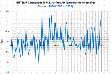 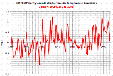 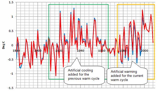 Since 2000, NASA has further “cleaned” the historical record. The following graph shows the further warming adjustments made to the data in 2005. (The data can be downloaded at data.giss.nasa.gov/gistemp/graphs/US_USHCN.2005vs1999.txt; the following graph is from www.theregister.co.uk/2008/06/05/goddard_nasa_thermometer/print.html). This figure plots the difference between the 2000 adjusted data and the 2005 adjusted data. Although the 2000 to 2005 adjustment differences are not as large as the 1999 to 2000 adjustment differences shown above, they add additional warming to the trend throughout the historical record. 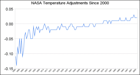 |
|
|
|
Post by visitor on Nov 13, 2011 19:29:32 GMT
marchesarosa - do you deny that the earth is warming?
|
|
|
|
Post by marchesarosa on Nov 13, 2011 19:38:25 GMT
Since when? You have to specify the period, visitor.
If you mean has it been warming since the Holocene climate maximum (or Thermal Optimum
as it used to be called pre IPCC) the answer is, no, it has been cooling.
If you mean since the Little Ice Age the answer is yes it has been warming.
Do we know why? No. I doubt that more than a tiny fraction of observed warming is due to
anthropogenic effects and anyway the variability is well within known natural climate variability.
A warmer world is a better world. Do you want to go back to the Little Ice Age
when people starved and plagues decimated the population?
|
|
|
|
Post by jean on Nov 13, 2011 20:32:12 GMT
A warmer world is a better world... Doesn't that depend on what part of it you're in? |
|
|
|
Post by marchesarosa on Nov 14, 2011 1:43:25 GMT
Jean here are a few facts about climate for you to ponder on. The greater part of the warming observed is in the higher latitudes of the Northern hemisphere. The warming is not occurring in the places that we currently call "hot" but in the places we call "cold". Warming is therefore an advantage in the higher latitudes of the Northern hemisphere because it means a longer growing season and more food production for the world. The problem for world food production would be if large parts of Canada and the USA experienced a cooler and therefore a shorter growing season because these regions are the bread baskets of the world. Most of the world's land and most of the world's population is in the northern hemisphere. Warming is of no hardship to them. You cannot make the world's climate stand still to suit some dogma about what is the Goldilocks "just right" temperture for it. The planet is still in a three million year long ice age interpolated with brief slightly warmer interglacials like the current one which permits mankind to thrive. (Clue - the still frozen polar regions and mountain tops!) Mankind has always adapted to changing climate and will continue to do so but cooling is what should be feared not everso slight warming. See this description of life in the Little Ice Age radio4scienceboards.proboards.com/index.cgi?board=witter&action=display&thread=1171 |
|